Week Three: Prototyping
Sketching
After creating our personas and scenarios, we began to create sketches for the main pages of our web application.
We started by creating several sets of sketches for each page of the website, which would act as initial designs for possible page layouts. We then took these initial sketches to our users, and asked to them choose which of the designs they preferred. Then for each of the pages, we developed a further set of improved sketched based on the intial sketch which appealed most to our users.
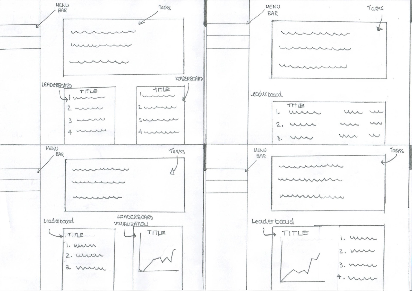
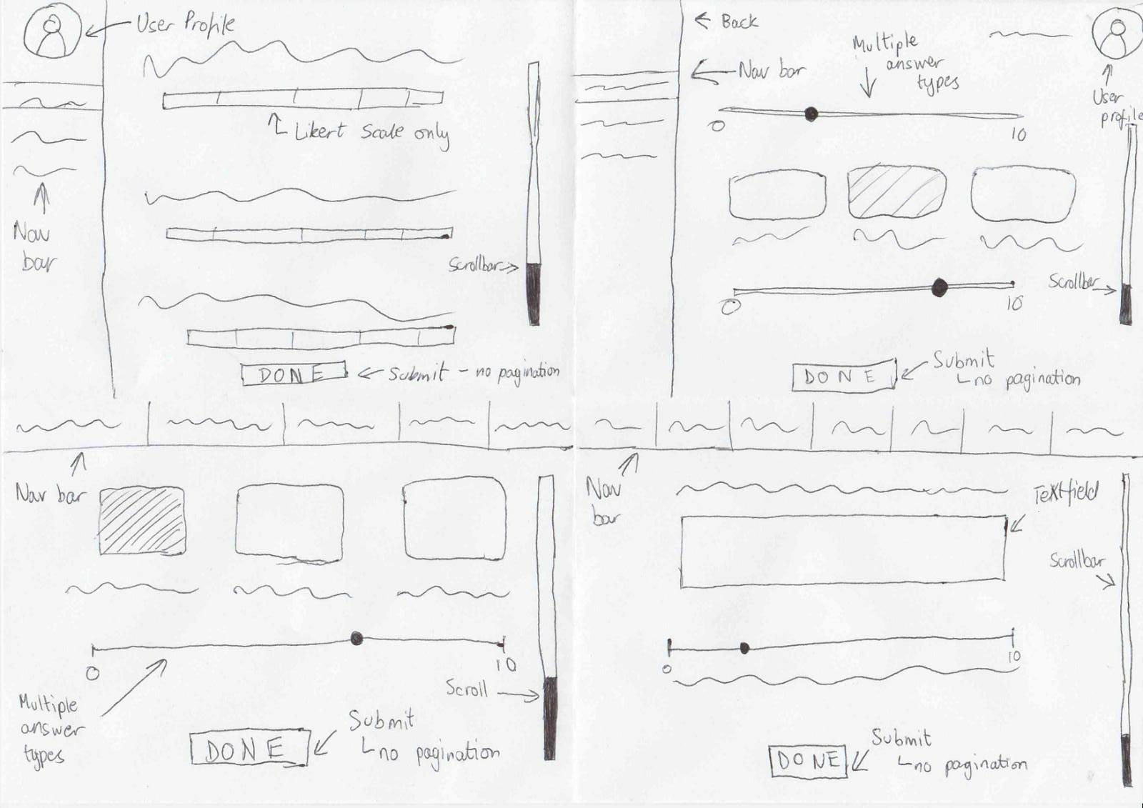
The images below show inital sketches for the teacher’s dashboard, student’s dashboard, and student feedback form.
Teacher Dashboard
Initial
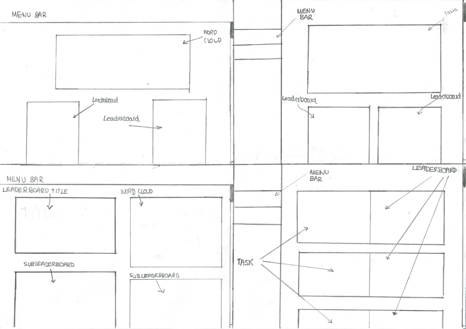
From these intial designs for the teacher dashboard, the users preferred the design in the top-right, stating that it was the most visually appealing layout. Therefore we produced the following improved sketches to develop on this initial design.
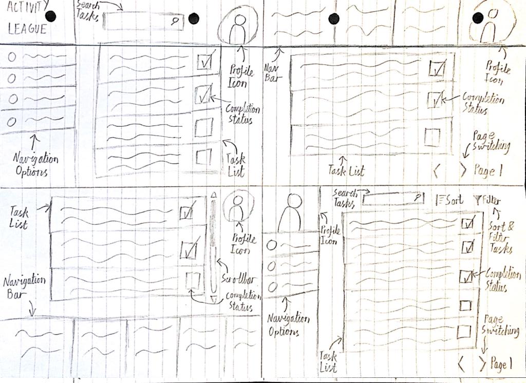
Improved
Student Dashboard
Initial
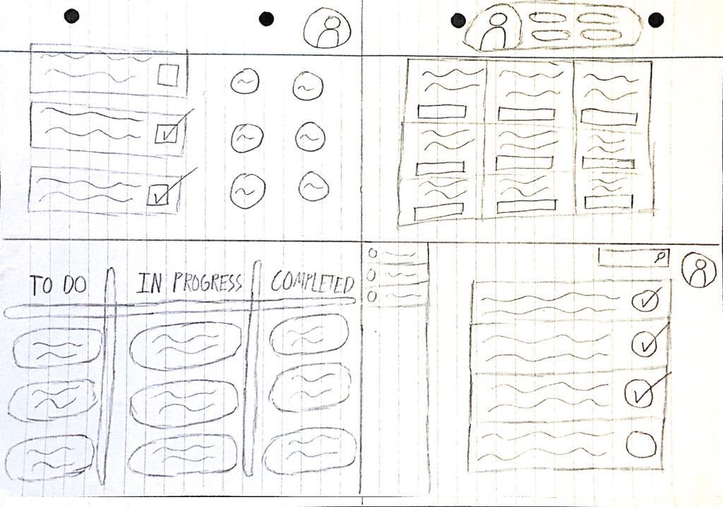
After consulting our users, there was a clear preference for the bottom-right design. One of the reasons given was that the simple list format for tasks was considered much more intuitive than the alternative designs. Another reason was the sidebard was the preferred option for navigation between pages.
Improved
Feedback Form
Initial
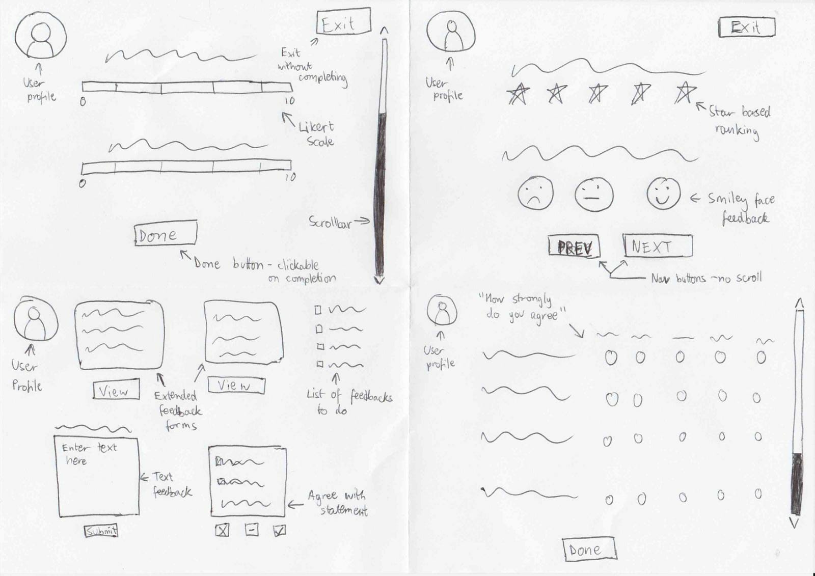
From the initial feedback form designs, the preferred layout was the design given in the top-right sketch. The users believed this design to have the best balance between simplicity and granularity of feedback.
Improved
Prototyping
Following the creation of our sketches, we began to design an interactive prototype of our system on Figma. This prototype did not include every page that our final website would consist of, however it contained the core pages which would give a good representation of how the final website would work, and how the different users would interact with it.
We produced two different Figma prototypes, each consisting of three pages. It was important to separate our prototypes in this way, as the final system would direct users to different areas of the website depending on whether they are a teacher or a student.
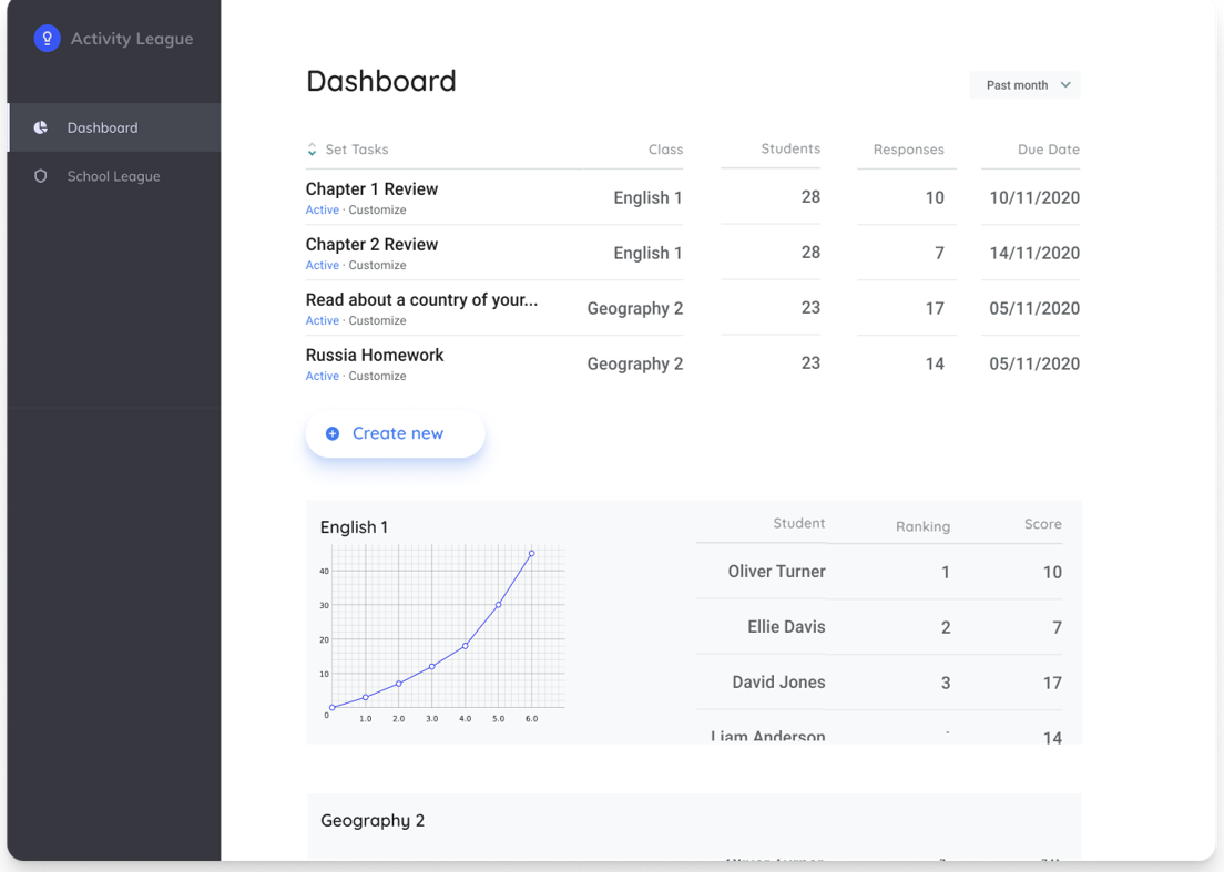
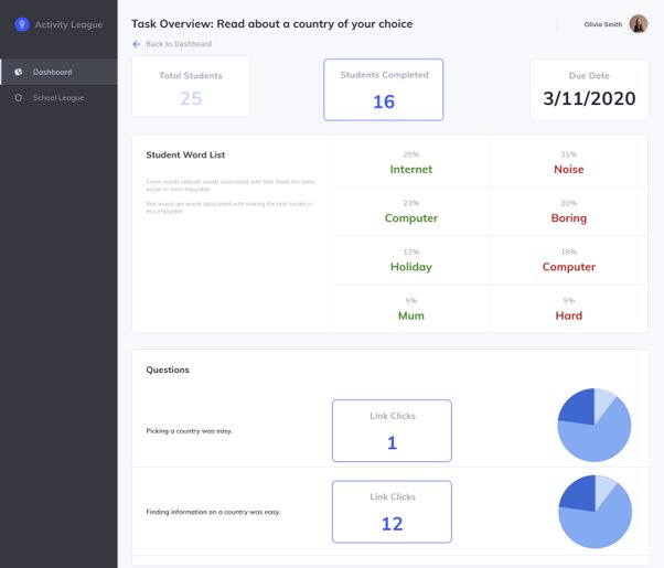
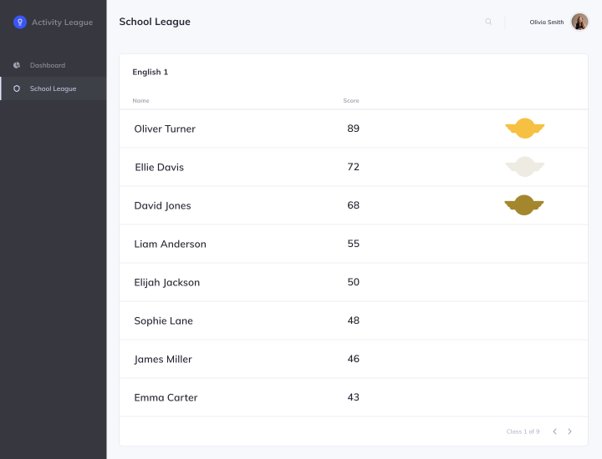
Teacher Prototype
The images below show the three main pages that a teacher would interact with on our system. The first of these is a dashboard where they can see an overview of the tasks that they have assigned to their different classes, as well as some data regarding the progress of each of these classes. The second page provides a more detailed overview of the feedback that students in a class have given for one specific task. The final page is a set of leaderboards which show rankings of the students in each class according to some given scoring function.
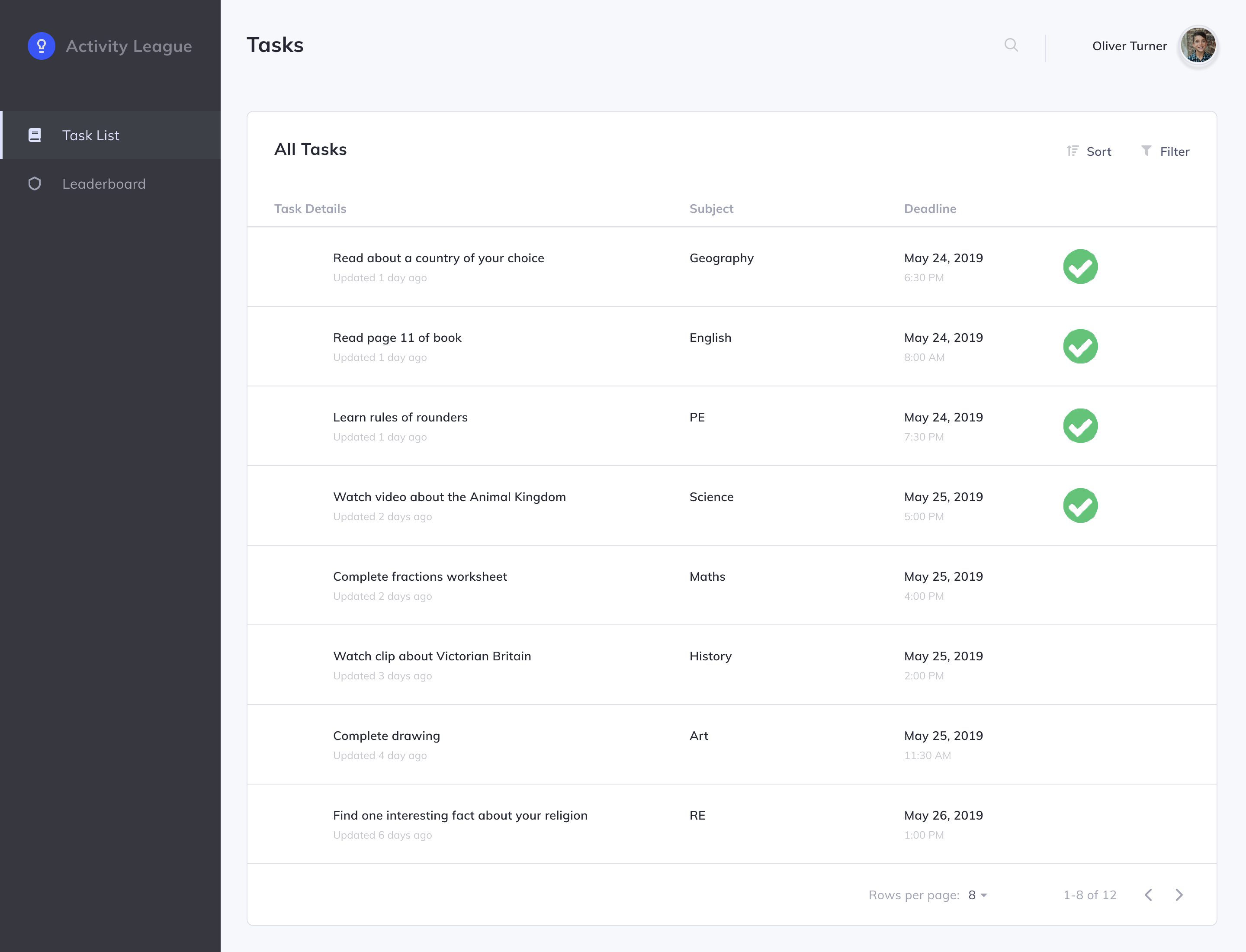
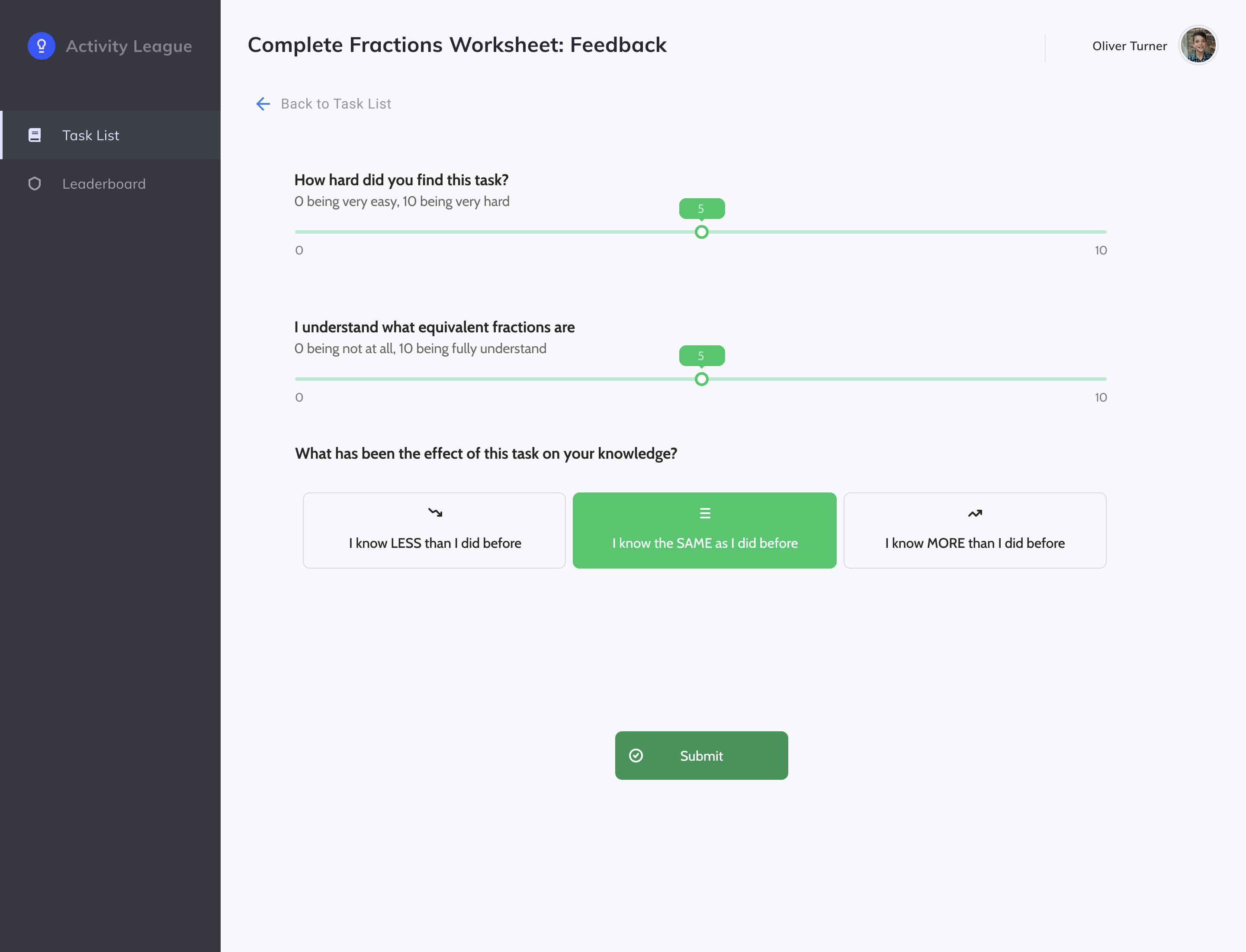
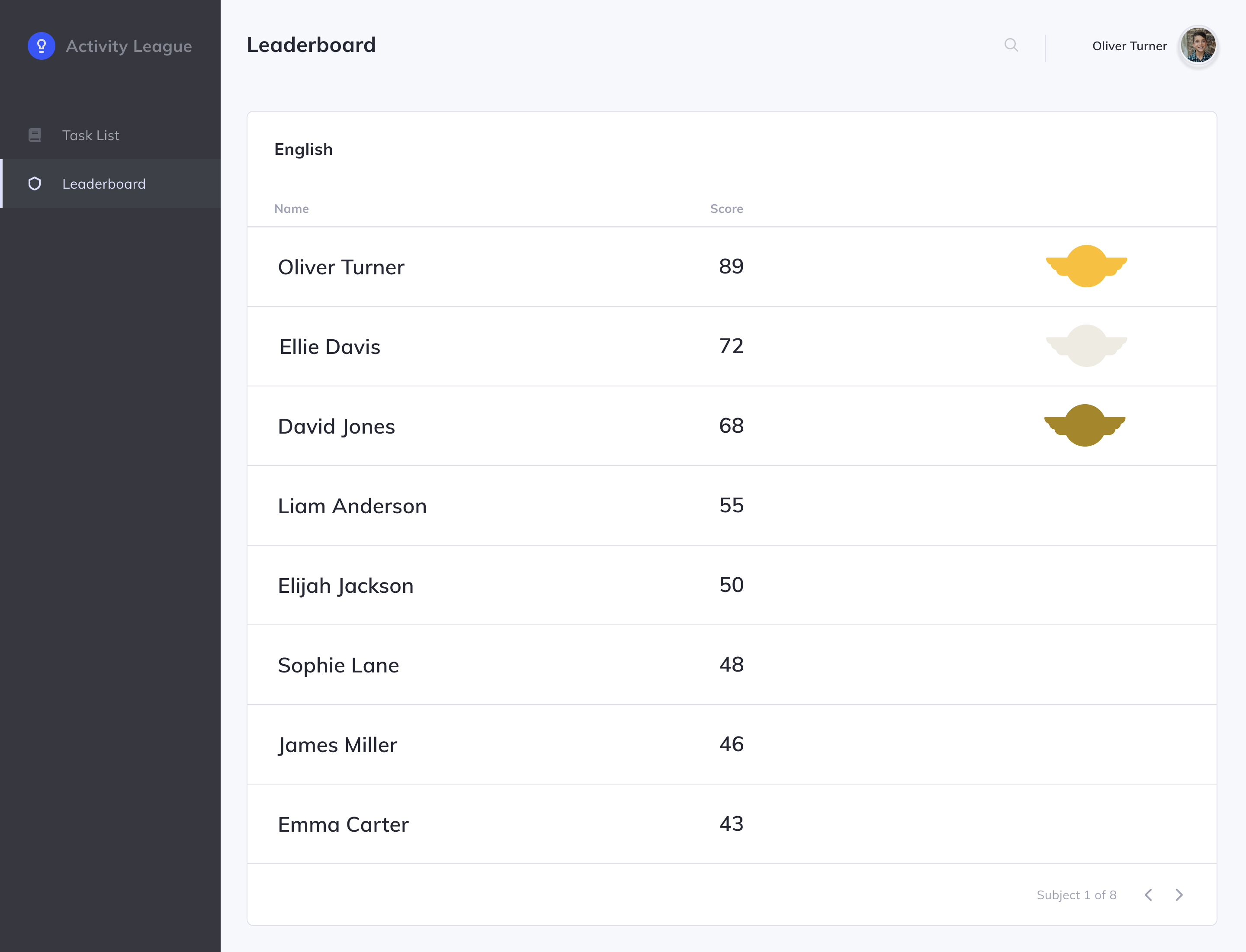
Student Prototype
Similar to the teacher prototype, the following images show the three main pages that a student would be interacting with on our system. The first is a list of tasks which they have been assigned by their teachers. The second page shows what the student would see if they were to click on one of these tasks; a feedback form which they would complete to provide relevant information to their teacher. Finally, as with the teacher prototype, the student would be able to see a leaderboard showing their ranking against the rest of their class.