Week Eighteen: Refactoring, Restyling, and Visualising User Progress
This week
This week we continued to work on testing for our application, and wanted to make a start on implementing some of the requested features from our client, such as importing multiple users.
However, as we continued to work on our application we found that the code was becoming unintuitive, and hindering our ability to work efficiently. Therefore, we thought it would be best to spend a large portion of this week to focus on improving our code quality.
Continue Unit Testing
Following on from the previous week, we continued to incrementally add more unit tests to ensure that we were testing as much of our codebase as possible. This process was made much easier with our new Github workflow which informed us which of the tests were passing/failing whenever we pushed to the main branch. By the end of the week we had achieved a code coverage of 93%, which we believed was more than sufficient for the time being. As we add more features to the application, we would also have to write more tests to cover this code for these new features.
Refactoring
Currently, the entire backend logic for our program is carried out in the views.py files for each of the Django applications. This has led to very large functions which carry out multiple different actions.
Ideally the functions in these views.py files should only serve a single purpose - to take the HttpRequest and render the appropriate template, passing the data needed for the template through the context dictionary. The actual logic used to generate this data should not be carried out in the views, but instead abstracted out into other functions.
We believed the best way to go about this was to create a utils.py file in each of the Django application folders (core, surveyor, respondent), where each file would contain the helper functions to be used in the corresponding views.
ActivityLeague
│
|   ...
|
└───core
│   │   views.py
|   |   utils.py
|   |   ...
|
└───surveyor
│   |   views.py
|   |   utils.py
|   |   ...
|
└───respondent
│   |   views.py
|   |   utils.py
|   |   ...
The main benefit of this abstraction was to have simpler, cleaner, single-purpose functions which would be easier to understand, and therefore extend. However, another benefit we found was that many of the views had similar logic, which meant that the same helper functions could be used in multiple views, therefore reducing the amount of repeated code.
The utils.py files in the surveyor and respondent applications are used to handle the logic for their respective views, however since the core application doesn’t have any views, the utils.py file in this folder is used to handle all of the common functionality between surveyor and respondent.
In addition to the views, another area where we refactored our code was in the templates. We decided to try to minimise the amount of JavaScript used, and instead using Django to handle as much of the dynamic HTML generation as possible.
An example of this is given below:
Old (JavaScript):
{% for group in groups %}
    <script>
    function render_graph(parent, title, labels, values) {
        var wrapper = document.createElement('div');
        wrapper.classList.add('row');
        wrapper.classList.add('bg-light');

        wrapper.style.margin = "20px";
        wrapper.style.borderRadius = "20px";

        var element = document.createElement('canvas');
        element.width = 900;
        element.height = 380;

        wrapper.appendChild(element);
        parent.appendChild(wrapper);

        new Chart(element, {
            type: 'line',
            data: {
                labels: labels,
                datasets: values,
            },
            ...
        });
    }
    </script>
{% endfor %}
New (Django):
{% for group in groups %}
    <div class="row bg-light" style="margin:20px;borderRadius:20px">
        <canvas id="{{ group.id }}" width="900" height="380">
        </canvas>
    </div>

    <script>
    var ctx = document.getElementById("{{ group.id }}").getContext('2d');
    new Chart(ctx, {
        type: 'line',
        data: {
            labels: {{ group.labels | safe }},
            datasets: {{ group.scores | safe }}
        },
        ...
    });
    </script>
{% endfor %}
Restyle Task Overview
One of the last pages on our website which didn’t have clean styling was the Task Overview page, so we decided to redesign this page.
As shown below, the updated version of the Task Overview page has the same cards at the top as the previous version, however the questions and data visualisations are now shown in an accordion rather than a table. This reduces the amount of clutter on the screen, and allows the user to only open the accordion associated with the question that they are currently interested in.
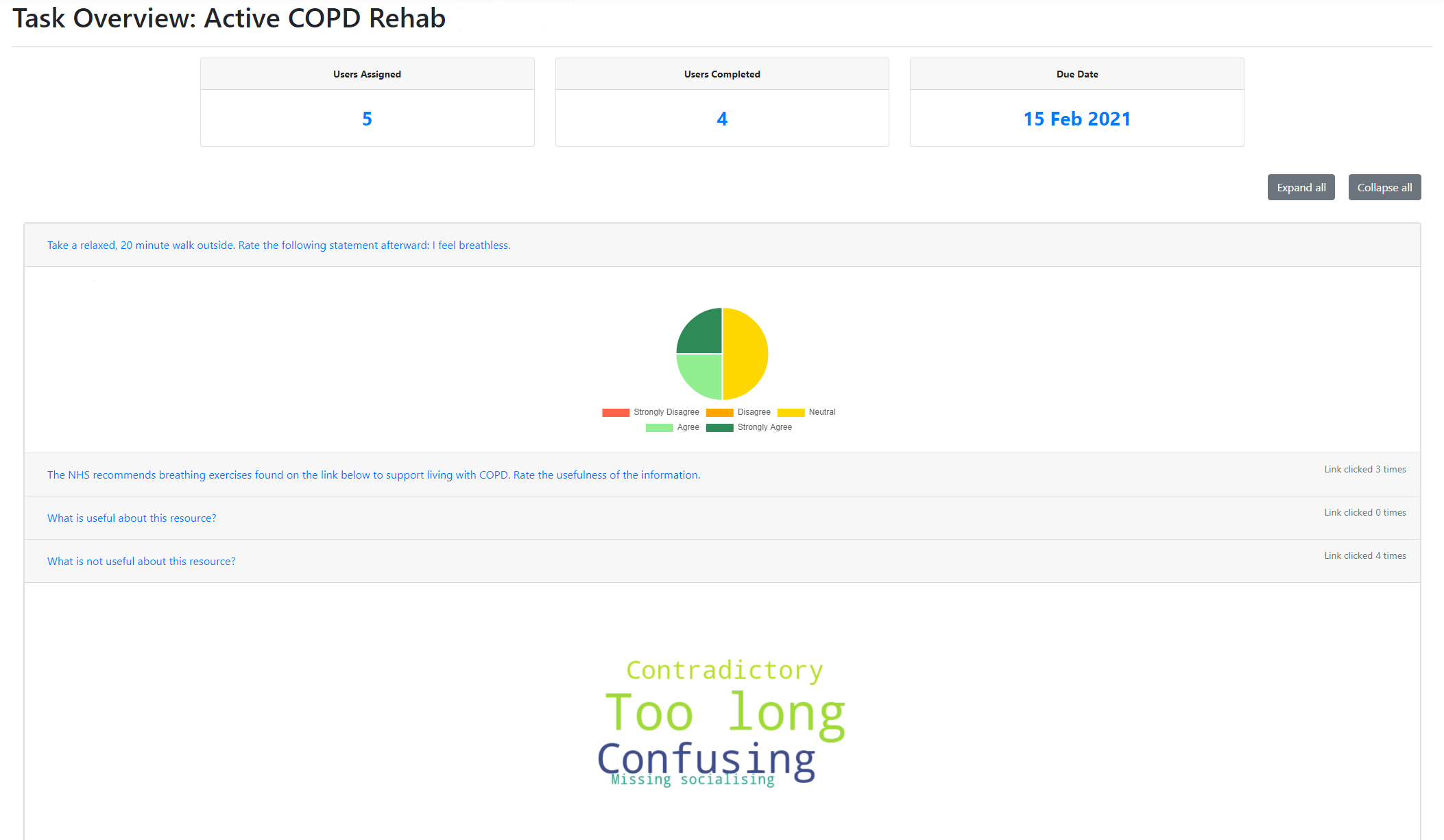
The content of each accordion is a pie chart or word cloud, depending on whether the question had a quantitative or qualitative response type. The accordion headers contain the questions themselves, as well as the number of times the associated link was clicked.
Although the content of the Task Overview page is the same as before, we believe this new redesign has led to a simpler and cleaner interface for the user.
Task History
When all of the Respondents assigned to a task have submitted their responses, this task will be marked as complete, meaning it will no longer be shown on the Surveyor’s dashboard. However, this means that there will be no historical data available for tasks that have been completed in the past.
For this reason, we have developed the Task History page, which shows all of the tasks that have been set by the current Surveyor, whether complete or incomplete.
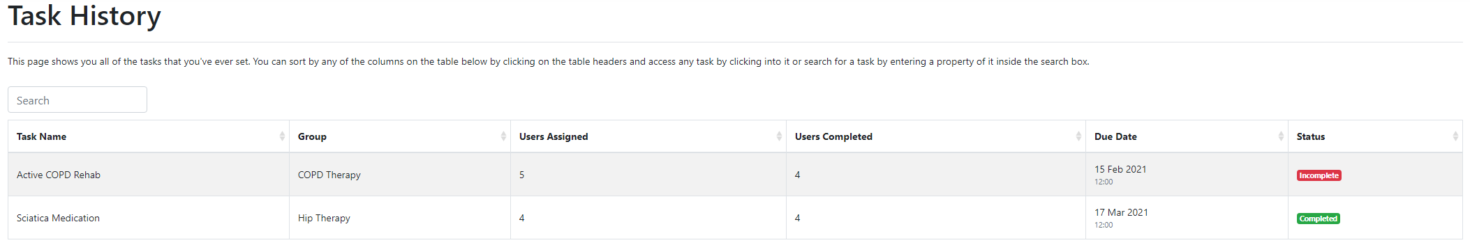
This table of tasks is expected to become very large over time, so we have allowed the user to sort the table by any of the available headings, or alternatively, search for a specific task.
As with the dashboard, each of these tasks can be clicked on to go to the corresponding Task Overview page.
User Progress
Although we have the Task Overview page to show aggregated data for any given task, our client requested that we also make visualisations available for aggregated data for a specific respondent.
Our solution to this is the User Progress page shown below.
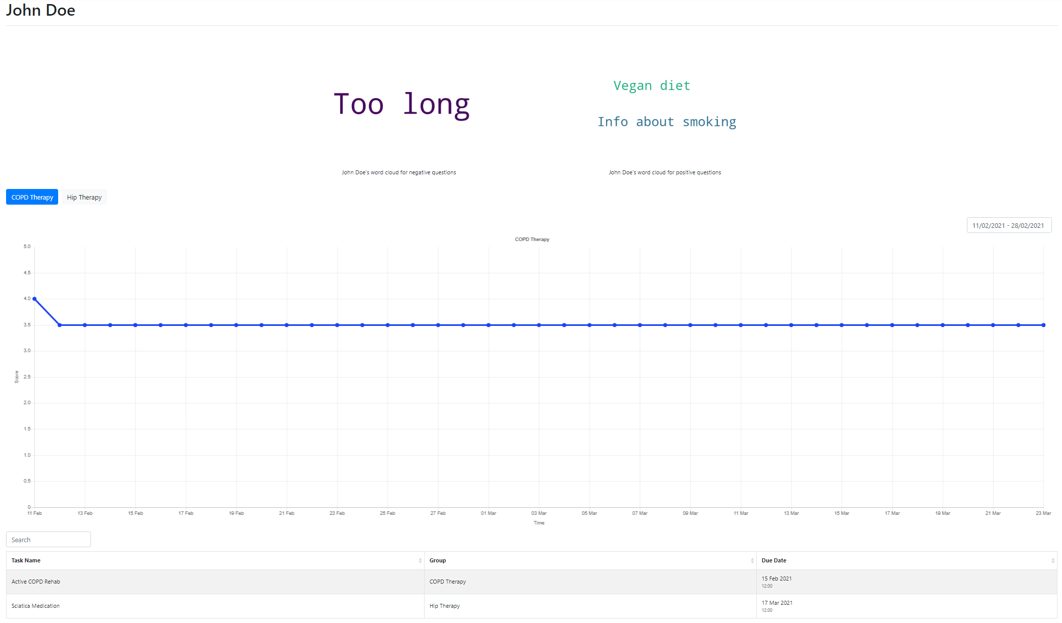
At the top of the page we can see word clouds for all of the positive and negative text responses that the user has submitted.
Below this, the Surveyor can switch between the tabs to show the progress graphs for the Respondent’s score over time within any given group.
At the bottom of the page, the Surveyor can see a list of all of the tasks that the Respondent has ever completed. Clicking into one of these tasks will take you to the page below, which allows you to see the respondent’s answers to each individual question in this task.
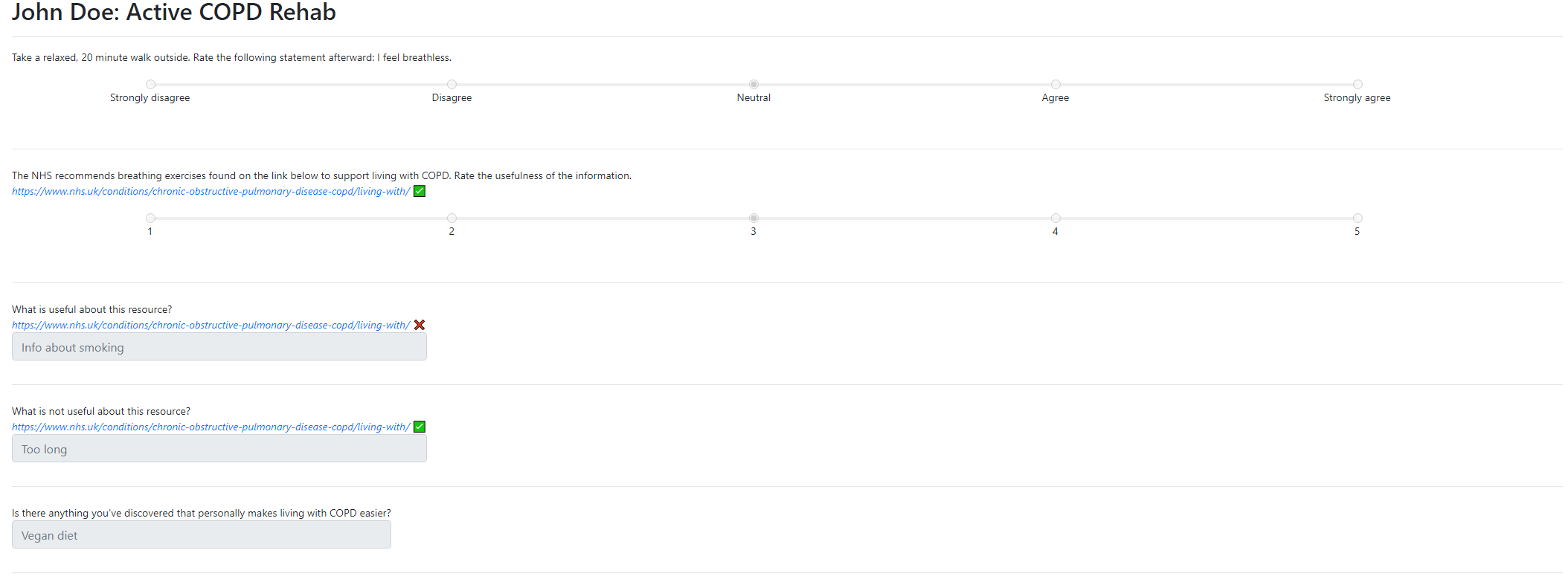
Questions that have an associated link will also show a tick or a cross, indicating whether or not the respondent has clicked on this link. If the link has been clicked, the Surveyor can infer that the Respondent may not have understood the question fully and needed assistance with producing an answer.
The addition of this page means that our application now allows the Surveyor to have high-level visualisations for progress of a group, as well as granular information about the individual responses given by a user, and how their score has changed over time.
Next Steps
Now that the code has been refactored, next week we plan to implement some of the changes suggested by our client, such as importing multiple users with a Microsft Excel spreadsheet. We will also begin the documentation of our codebase.