HCI (Human Computer Interaction)

After completing requirements gathering and research of related technologies, we started designing user interfaces which were tailored for the user. Throughout the process, we went through several iterations, and was in constant communication with our client and with potential users who fit the demographic of medical professionals and researchers. We had to source potential and anonymous users through online services since real users were unavailable to us.

During this process, we refined the user interfaces and the features required to ensure the best user experience. We improved after each iteration by taking feedback onboard and continuously made advancements to the designs of the solution. We initially began by drawing up some potential designs based on the finalised project requirements which had been agreed upon in the previous section. This is followed by iterations of prototypes.

Design Alternatives

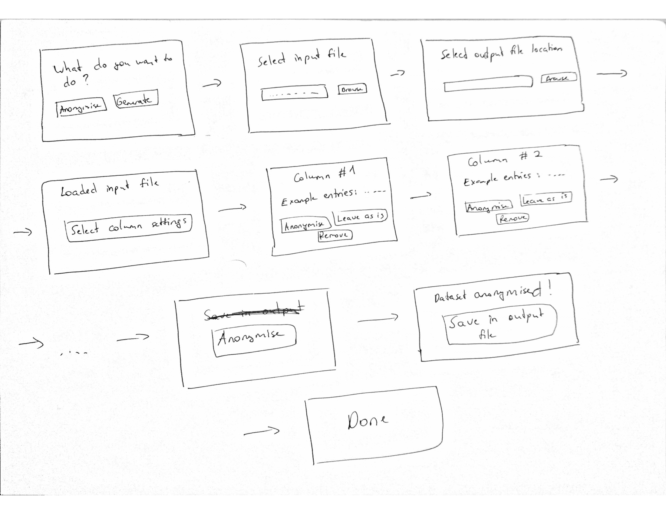
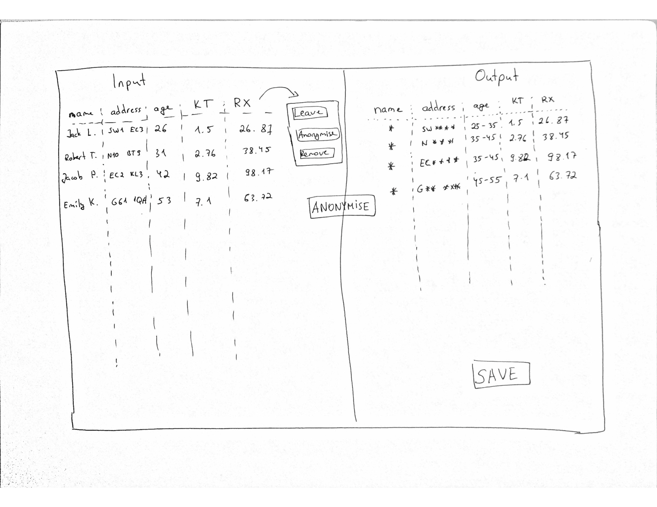
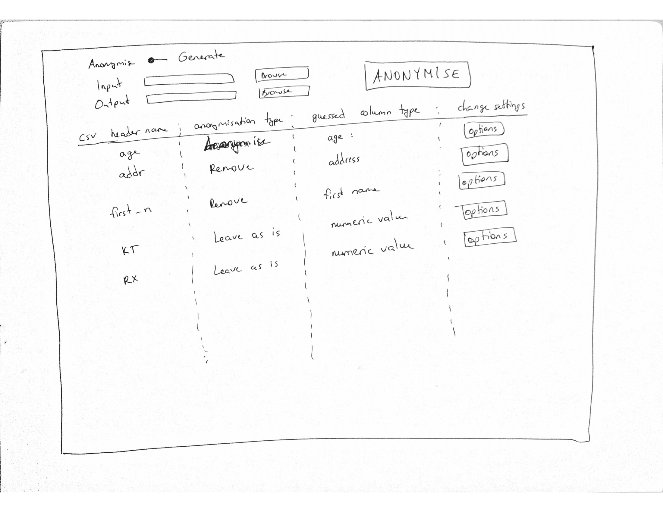
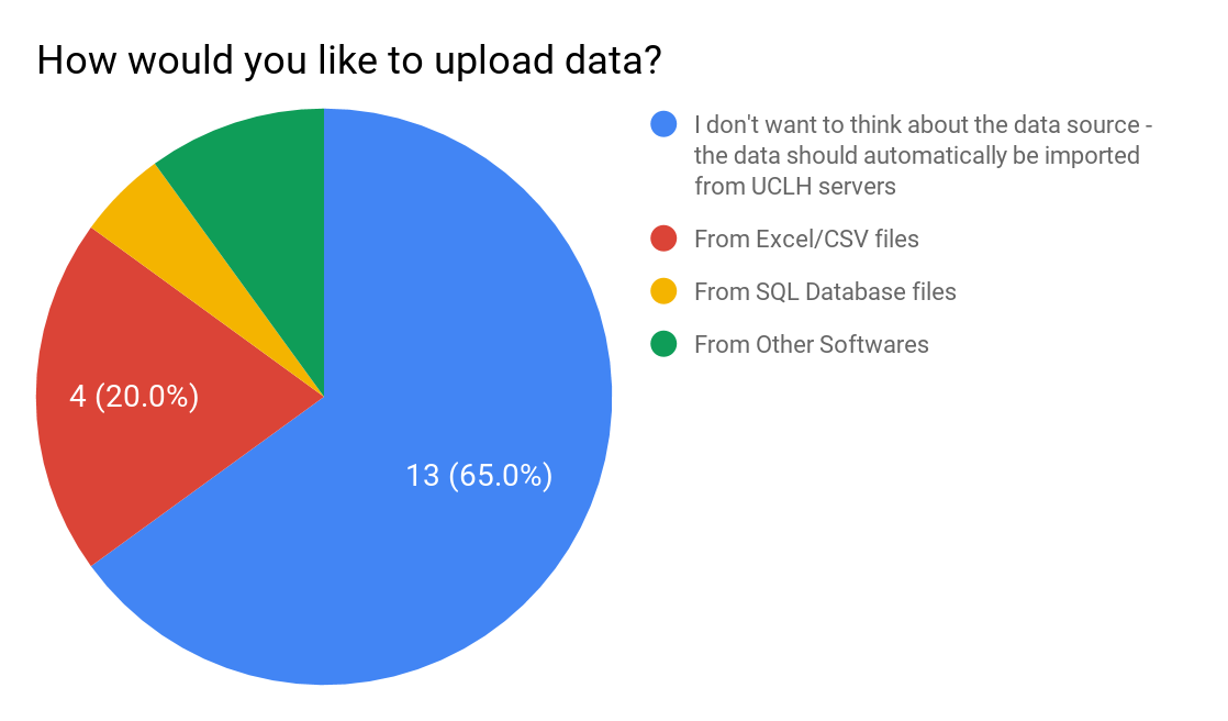
For the data anonymisation, having analysed user needs from initial requirements gathering, it was decided that the tool must allow users to easily import databases or files of different formats from multiple sources. Additionally, it was noted that users should be easily able to select rows and columns from desired data sources. As such, we created designs which would allow users to easily import data from sources and configure options for anonymisation. The designs have different views but all of them support options for each column which have been imported from the source. As is seen with the potential designs, there are three alternatives. With one, the view changes after each time the user inputs into the tool and a simple interface is provided on each view. The other two display all options on one screen.


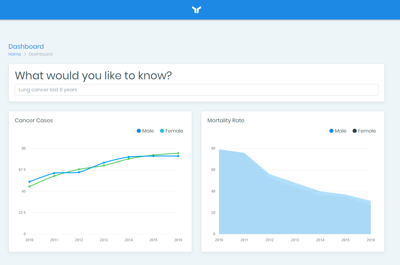
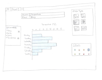
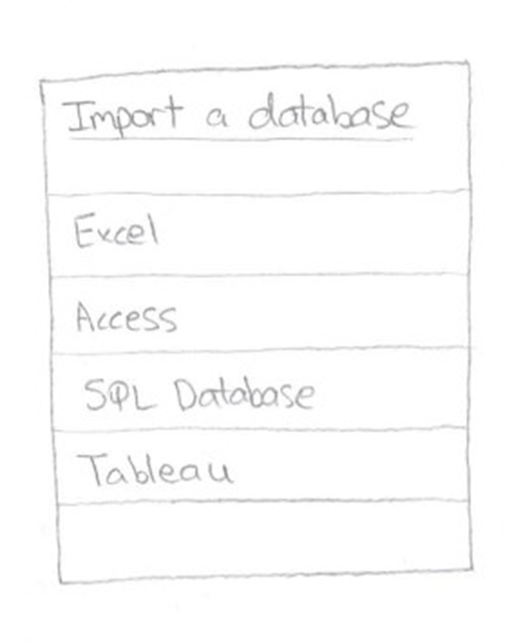
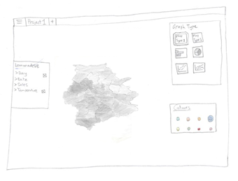
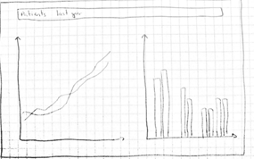
Having analysed user needs for the analytics visualisation solution, it was decided that features such as allowing users to search for information is required. Additionally, the visualisations should be available in different formats and be interactive as well. Taking these ideas on board, some designs were created and the aim to allow users to import from sources was introduced. The design allowed users to input sources which is then graphed and charted for visualisation. In the designs created, different graph types were thought about and different options to interact with the displays was drawn too. A couple of the designs allows users to interact with toolbars, while others had search boxes.

User Feedback on Design Alternatives

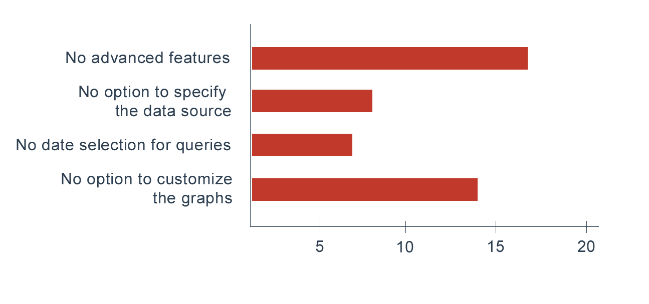
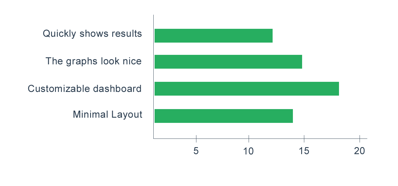
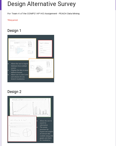
Following the sketches of possible designs, we choose a selection and gained feedback from twenty users. We targeted these users by creating a survey on Amazon Mechanical Turk and Google Forms, where we were able to specify a target demographic. The target demographic was doctors who have competence with technology and wish to take part in active medical research. The forms and their results are shown below.


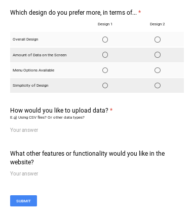
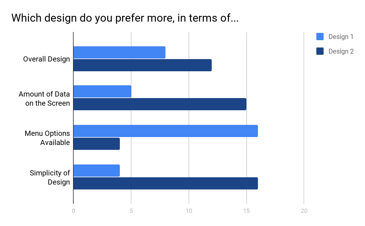
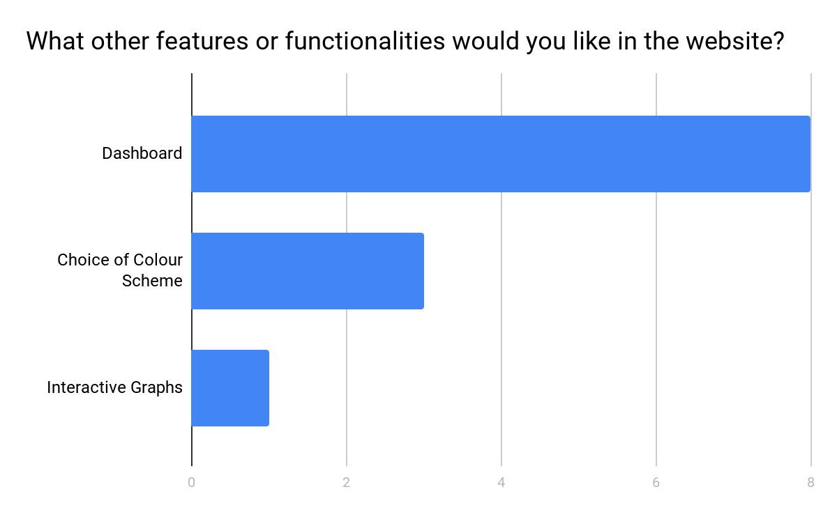
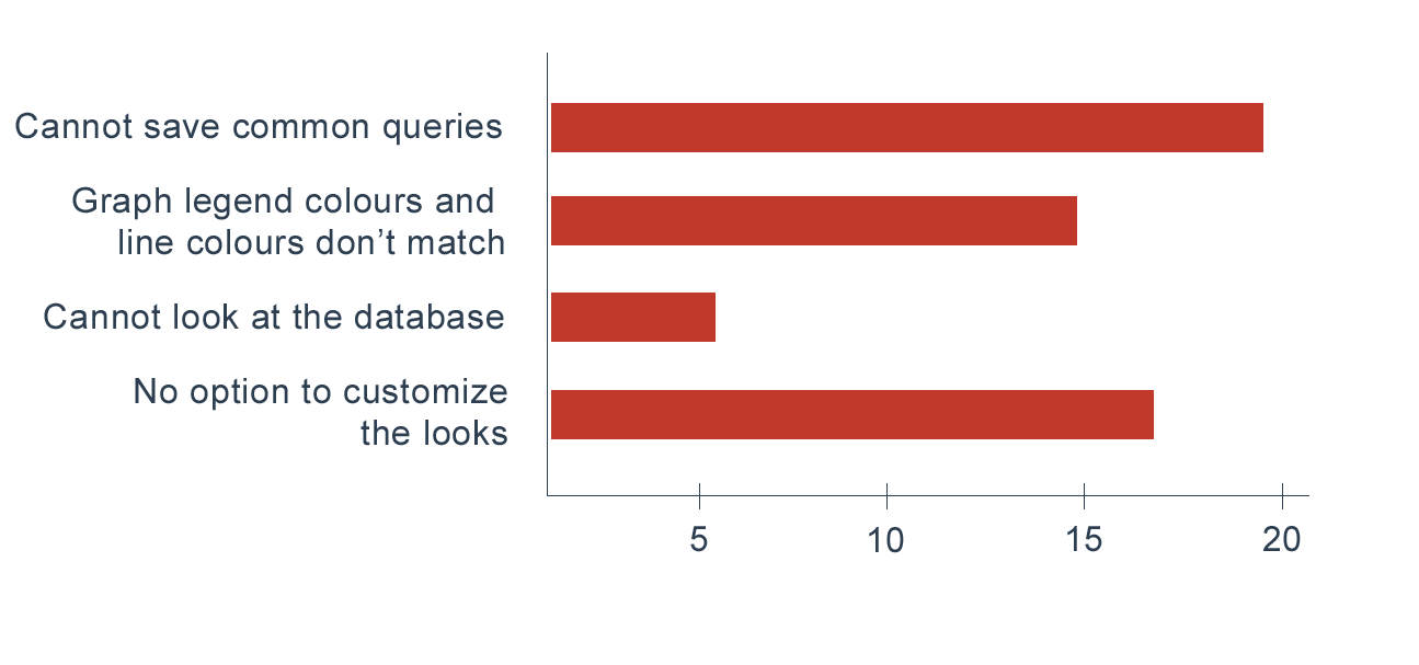
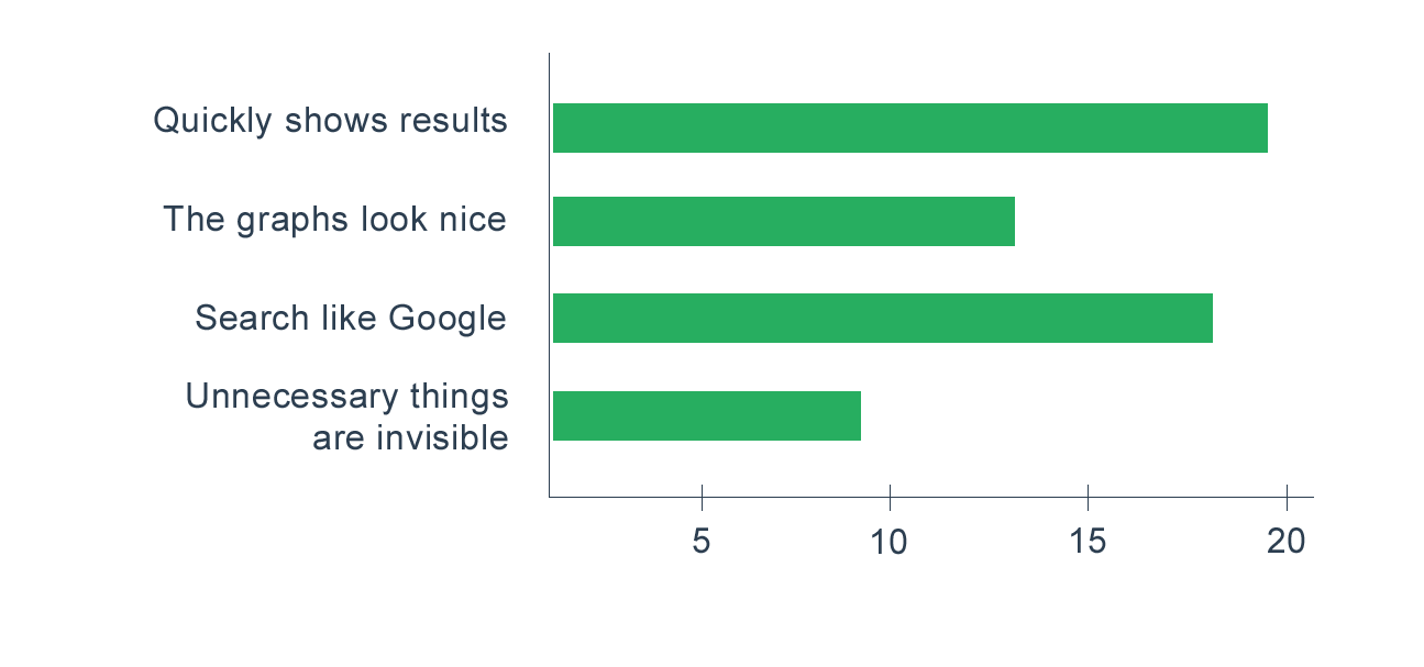
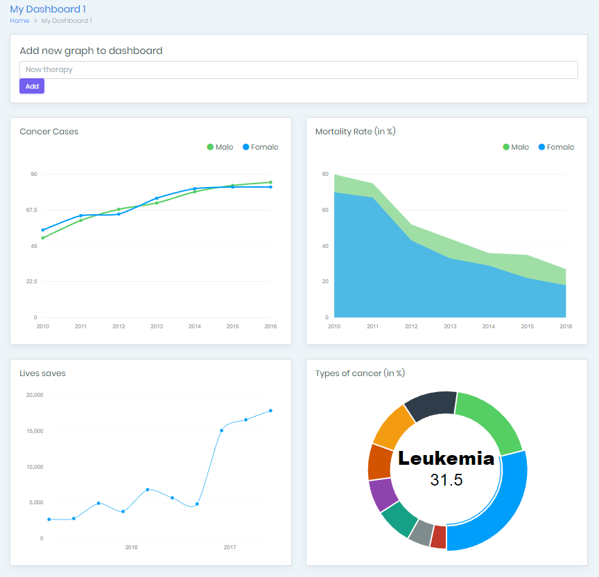
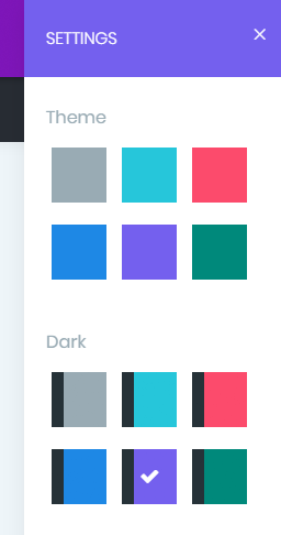
Overall the designs for both the anonymiser and the visualiser met the requirements but there were features which users prefered more. For example, with the anonymisation tool, users prefered to have the view all on one page, they did not like having a different view for each column selection. As with the visualiser, it had simple design and menu options were available, but users disliked the lack of a dashboard which they can use to view and easily navigate to different parts of the application quickly.

Prototyping

Next, having completed feedback gathering of the initial designs and having reflected on this, we created an initial prototype and this would go through a series of iterations before the final product.

With the data anonymiser tool, after taking user feedback on, it was decided that new views for each user input would not be appropriate and instead, a better user experience would be provided if all options to anonymise a dataset is on the screen at the same time. Additionally, it was decided that data has either been anonymised or generated, the output of the anonymised file does not need to be displayed. Users do not prefer this and we are guessing it is because once a dataset has been anonymised, there is no need for them to have to view the desensitised data since trust has been place with the anonymisation application. As a result, the first prototype reflects on these decisions.

For the analytics visualisation solution, it was noted that users did not like some of the interface designs. In some cases, users felt that there was either too much data on the screen or not enough, to solve this, we aimed for most customisation so that users can choose what they wish to have on their displays. As a result of this user feedback, the first prototype of the visualisation application allows users to simply type a question or query and view the results. It provides a simple and minimalistic design, allowing for a better and less frustrating user experience. FInally, it does not require the user to upload specific and analysed data. Information is gathered and all data is analysed in the cloud.

User Evaluation of Prototype

After interviews with users, we found…

Positives

  • Most users liked the ease of use and how well the prototype visualises the queries

Negatives

  • Most users had to retype some queries very often, so they would like an option to save them
  • Many also wanted to personalise the UI appearance
Design Improvements

  • Added customisable dashboards
  • Fixed colours in the graphs
  • Added more types of graphs
  • Improved the speed
  • UI is now responsive (works on big screens and mobile)

Expert Group

  • Improved colour accessibility → added themes
  • Error prevention and recovery → error messages
  • Automation: eliminate mental calculations → better graphs

Lab Tests

  • Users could navigate through the app easily
  • Users complained about not being able to use more complex queries
  • Overall, the users liked the ease of use of the app
End Prototype

Evaluation

After interviews with users, we found…

Positives

  • Most users liked the option to create their own dashboards and the overall design of the app

Negatives

  • Many users wanted advanced features
  • Some also wished to switch to more complex graph types
References
  • [1] H. Sharp, Y. Rogers and J. Preece, Interaction design. Chichester: John Wiley, 2009.
  • [2] S. Greenberg, Sketching user experiences. Amsterdam: Elsevier, 2012.
  • [3] J. Linowski, "GoodUI | Good User Interfaces for higher conversion rates and ease of use", Goodui.org, 2018. [Online]. Available: http://www.goodui.org/. [Accessed: 07- Mar- 2018].
  • [4] "Case Study: Health Care App. UI for Doctors.", Tubik Studio. [Online]. Available: https://tubikstudio.com/case-study-health-care-app-ui-for-doctors/. [Accessed: 07- Mar- 2018].
  • [5] B. Shneiderman, C. Plaisant, M. Cohen, S. Jacobs and N. Elmqvist, Designing the user interface. .
  • [6] J. Nielsen, Usability engineering. Amsterdam [etc.]: Morgan Kaufmann, 2009.